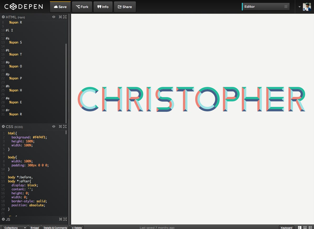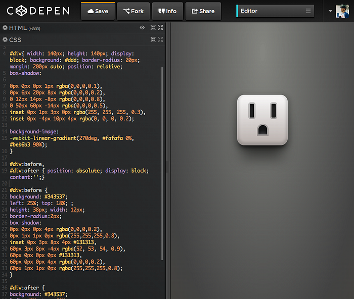
A while back, I made a blog post on DesignHui called Designing With Code where I briefly highlighted my fascination with creating designs in-browser with as little code as possible and using no images. After practicing on CodePen for a while, I wanted to share small, simple hints on how to illustrate an object.
Working knowledge of HTML and CSS is required.
Start With Simple Objects
You need to learn to crawl before you can walk or run. The same principles can be applied to drawing or in this case, creating objects using pure HTML and CSS. Think about coding simple objects first:
Square
width: 50px; height: 50px; background: #000;
Rectangle
width: 100px; height: 50px; background: #000;
Circle
width: 50px; height: 50px; background: #000; border-radius: 50% (or half the width and height — 25px);
Triangle
width: 0; height: 0; border-bottom: 100px solid #000; border-left: 50px solid transparent; border-right: 50px solid transparent;
Change the measurements of the left and right borders to increase or decrease the width of the triangle. Try adding different colors to each border to understand how triangles work.
Trapezoid
width: 100px; height: 0; border-bottom: 100px solid #000; border-left: 50px solid transparent; border-right: 50px solid transparent;
Similar to a triangle, but the width creates the shape.
How can you combine them? How you can you form other shapes or objects? I randomly stumbled across this amazing site showcasing student work. Can you break down each object into basic shapes?
Looking for more shapes? Check out CSS Tricks.
Pseudo-Elements
The ::before and ::after pseudo-elements are nice tricks to help you design your object without creating move divs. You can think of a single div equaling three divs in reality.
#div{}
#div::before{}
#div::after{}

Keep in mind that pseudo-elements are empty, inline elements. To display your shape, be sure to add: content:“”; and display: block; Text is usually added between the quotation marks, but keep it empty in this case.
Experiment with positioning and z-index to create unique shapes.
Borders and Box Shadows
As you can see from the example above, borders can be used to create shapes such as triangles or trapezoids. Are you able to create a pentagon with only one div? Hint: Stack a triangle on a trapezoid while utilizing psuedo elements.
Box shadows could be thought of the same as drop shadows — it mimics a shadow similar to it’s object. Imagine applying the drop shadow layer style the same way you do in Photoshop: You can control the distance on the X and Y axis, amount of blur, amount of spread, and depending how you set your color, opacity.
Other box shadows properties also allow a user to add as many shadows as you want to a single element and/or add an inner shadow. But remember your element will need a height and width for this property to work.
Basic box-shadow property
box-shadow: 10px -20px 30px 40px rgba(0,0,0,0.5);
The first number 10px applies to the position on the x-axis.
The second number -20px applies to the position on the y-axis.
The third number 30px applies to the amount of blur to apply.
The fourth number 40px applies to the amount of spread. In essence, it makes the shadow forty times bigger than the original object.
The last property is applying a black shadow (rgb: 0,0,0), with a transparency of 50% (a: 0.5).
By applying box shadows cleverly, you can create detailed, complex objects with only one div.

Looking for a simple object to draw which utilizes box shadows? Try a circular knob. UI Parade has a lot of great examples if you want to try and copy an illustration, but I would skip trying to make it look like brushed metal.
HAML & SCSS
HAML
In a nutshell, HAML is a quicker way (for some) to write HTML. Instead of typing out:
<div id=”hello”></div>
one can simply write:
#hello
I won’t go into details because I don’t know its full capabilities, but it has helped me code a little quicker. If you are curious about learning it, I encourage you to read up on it.
SCSS
Scss (or Sass) can be compared to using classes in your HTML. If you are using the color red in more than one place in your stylesheet, you can declare a variable at the start of your stylesheet, such as:
$red: #ff0000;
Now every time the color red is used in your stylesheet, you redeclare the variable:
background: $red;
color: $red;
box-shadow: 0, 0, 0 $red;
Need to change the color? No problem. Change the hex value that you declared and it will be replaced throughout the entire stylesheet.
Defining colors is considered a poor practice by some but was used for a quick example.

Although these aren’t the practical uses of HAML or SCSS, it is a very simple way to become familiar with it and hopefully incorporate it into your workflow more often.
Practice
It started with a simple knob, but it quickly turned into an obsession. I kept challenging and pushing myself to learn different CSS properties in order to improve my in-browser designs. I slowly began to understand the simple things such as box shadows, which made me want to learn about more, complex properties.

But what is the point? Can’t you use SVG? Can’t you design it in Photoshop or Illustrator?
In reality, there is no point. I do it for fun, but in return it helps me code quicker and forces me to think of different ways to implement HTML and CSS. Nowadays, I try to spend less than 3-4 hours on each pen and move on so I don’t get caught up or frustrated in something I may not be able to accomplish.

Practice makes perfect, right?
In the end, I can only suggest finding a simple object, mentally break it down into basic shapes, use the CSS properties you know, and start to experiment. You will never know until you try.
Happy penning.
